2. Frequency Distribution
Frequency Distribution facilitates the interpretation of a given set of data because they are separated into groups with similar elements.
Details
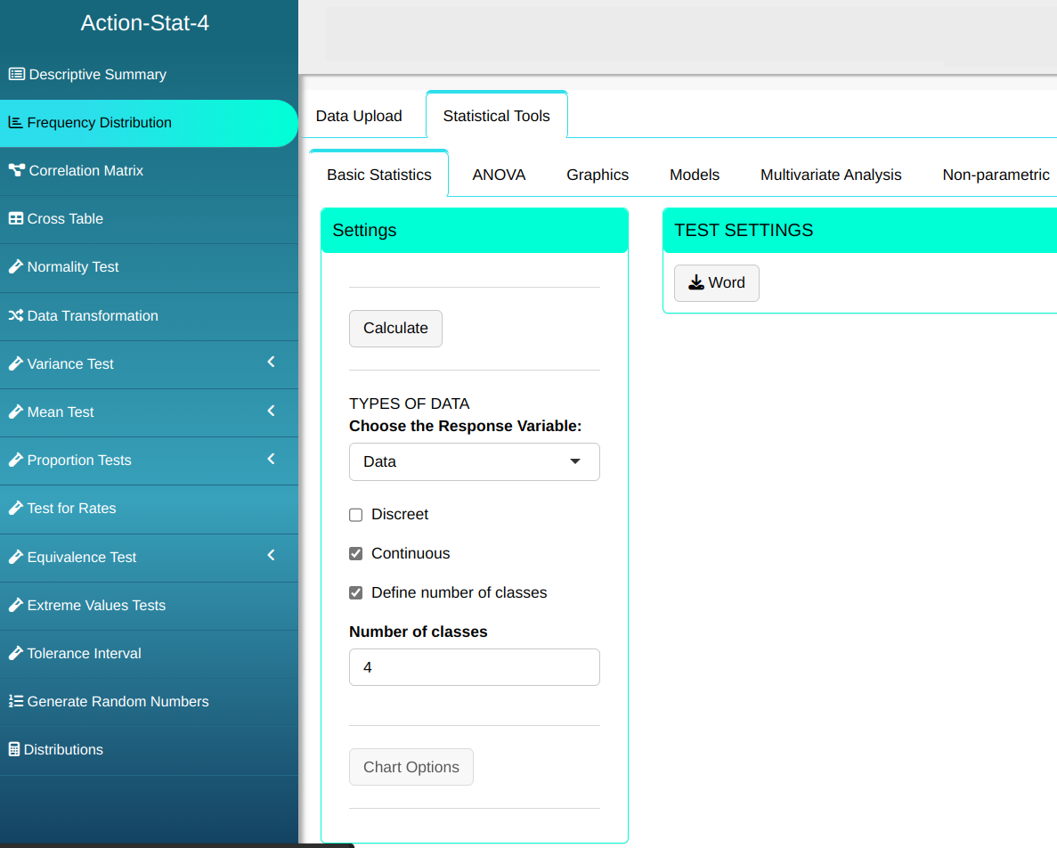
Action’s Frequency Distribution tool allows you to separate data into classes, the result of which is presented in a table and a bar graph. The graph can be customized in Graph Options.
Example:
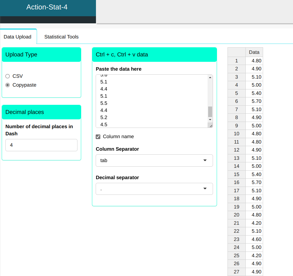
In a small motor factory, problems were occurring with the shaft. They decided to measure the diameter of 200 motors and the result is shown in the table below.
| Data |
|---|
| 4.8 |
| 4.9 |
| 5.1 |
| 5 |
| 5.4 |
| 5.7 |
| 5.1 |
| 4.9 |
| 5 |
| 4.8 |
| 4.8 |
| 4.9 |
| 5.1 |
| 5 |
| 5.4 |
| 5.7 |
| 5.1 |
| 4.9 |
| 5 |
| 4.8 |
| 4.2 |
| 5.1 |
| 4.6 |
| 5 |
| 4.2 |
| 4.9 |
| 4.9 |
| 4.8 |
| 5.2 |
| 5.1 |
| 4.2 |
| 5.1 |
| 4.6 |
| 5 |
| 4.2 |
| 4.9 |
| 4.9 |
| 4.8 |
| 5.2 |
| 5.1 |
| 5.1 |
| 4.8 |
| 4.9 |
| 5 |
| 5.1 |
| 5.2 |
| 4.9 |
| 4.2 |
| 4.2 |
| 4.6 |
| 5.1 |
| 4.8 |
| 4.9 |
| 5 |
| 5.1 |
| 5.2 |
| 4.9 |
| 4.2 |
| 4.2 |
| 4.6 |
| 5.2 |
| 4.9 |
| 4.3 |
| 5.1 |
| 4.9 |
| 4.8 |
| 5.1 |
| 5.2 |
| 4.9 |
| 4.8 |
| 5.2 |
| 4.9 |
| 4.3 |
| 5.1 |
| 4.9 |
| 4.8 |
| 4.9 |
| 5.2 |
| 4.9 |
| 4.8 |
| 4.8 |
| 4.8 |
| 4.9 |
| 4.9 |
| 4.3 |
| 4.9 |
| 5.2 |
| 5.1 |
| 5.1 |
| 5.2 |
| 4.8 |
| 4.8 |
| 4.9 |
| 4.9 |
| 4.3 |
| 4.9 |
| 5.2 |
| 5.1 |
| 5.1 |
| 5.2 |
| 4.7 |
| 5 |
| 4.7 |
| 4.8 |
| 4.6 |
| 4.9 |
| 4.7 |
| 4.7 |
| 4.6 |
| 4.5 |
| 4.7 |
| 5 |
| 4.7 |
| 4.8 |
| 4.6 |
| 4.9 |
| 4.7 |
| 4.7 |
| 4.6 |
| 4.5 |
| 4.9 |
| 5.3 |
| 5.2 |
| 4.8 |
| 4.7 |
| 4.4 |
| 4.8 |
| 5.5 |
| 5.4 |
| 4.9 |
| 4.9 |
| 5.3 |
| 5.2 |
| 4.8 |
| 4.7 |
| 4.4 |
| 4.8 |
| 5.5 |
| 5.4 |
| 4.9 |
| 4.5 |
| 4.9 |
| 4.8 |
| 5 |
| 4.7 |
| 4.7 |
| 4.6 |
| 4.7 |
| 4.6 |
| 4.5 |
| 4.7 |
| 4.9 |
| 4.8 |
| 5 |
| 4.8 |
| 4.7 |
| 4.7 |
| 4.6 |
| 4.7 |
| 4.6 |
| 4.9 |
| 5.5 |
| 4.4 |
| 4.8 |
| 5.3 |
| 4.9 |
| 5.2 |
| 4.7 |
| 4.8 |
| 5.4 |
| 4.9 |
| 5.5 |
| 4.4 |
| 4.8 |
| 5.3 |
| 4.8 |
| 5.2 |
| 4.7 |
| 4.8 |
| 5.4 |
| 4.5 |
| 5.2 |
| 5.6 |
| 4.5 |
| 5.1 |
| 4.4 |
| 5.1 |
| 5.5 |
| 4.4 |
| 5.2 |
| 4.5 |
| 4.5 |
| 5.2 |
| 5.6 |
| 5.1 |
| 4.4 |
| 5.1 |
| 5.5 |
| 4.4 |
| 5.2 |
By uploading data we have:
Configuring according to the figure below to make the Frequency Distribution
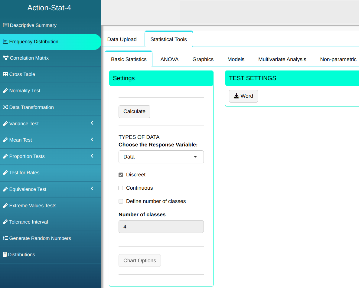
Then click Calculate to get the results. You can also generate the analyses and download them in Word format.
We obtain the following results:
Frequencies Table
| Factors | Frequency | Relative Frequency | Percentage Frequency | Cumulative Frequency |
|---|---|---|---|---|
| 4.2 | 8 | 0.040 | 4.0 | 4.0 |
| 4.3 | 4 | 0.020 | 2.0 | 6.0 |
| 4.4 | 8 | 0.040 | 4.0 | 10.0 |
| 4.5 | 8 | 0.040 | 4.0 | 14.0 |
| 4.6 | 12 | 0.060 | 6.0 | 20.0 |
| 4.7 | 19 | 0.095 | 9.5 | 29.5 |
| 4.8 | 30 | 0.150 | 15.0 | 44.5 |
| 4.9 | 36 | 0.180 | 18.0 | 62.5 |
| 5.0 | 12 | 0.060 | 6.0 | 68.5 |
| 5.1 | 23 | 0.115 | 11.5 | 80.0 |
| 5.2 | 20 | 0.100 | 10.0 | 90.0 |
| 5.3 | 4 | 0.020 | 2.0 | 92.0 |
| 5.4 | 6 | 0.030 | 3.0 | 95.0 |
| 5.5 | 6 | 0.030 | 3.0 | 98.0 |
| 5.6 | 2 | 0.010 | 1.0 | 99.0 |
| 5.7 | 2 | 0.010 | 1.0 | 100.0 |
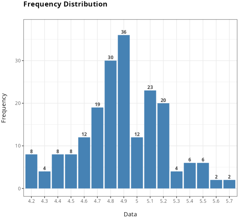
With result, we get the data count. Note that the data is most concentrated between values 4.6 and 5.2.
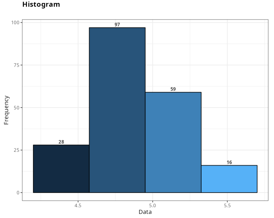
Now we will select the data as continuous and separate the data into 4 classes. Configuring as shown below.
We obtain the following results:
Frequency Table
| Class | Frequency | Rel. Freq. | Perc. Freq. | Cum. Freq. | Density | Median point |
|---|---|---|---|---|---|---|
| [4.2; 4.575) | 28 | 0.140 | 14.000 | 14.000 | 0.373 | 4.388 |
| [4.575;4.95) | 97 | 0.480 | 48.500 | 62.500 | 1.293 | 4.763 |
| [4.95;5.325) | 59 | 0.300 | 29.500 | 92.000 | 0.787 | 5.138 |
| [5.325; 5.7) | 16 | 0.080 | 8.000 | 100.000 | 0.213 | 5.513 |
Normally, when the variable is discrete qualitative or quantitative, the Analysis is done without dividing into class intervals. Divide into class intervals when the variable being analyzed is a continuous quantitative variable.