1. Bar Chart
The bar chart is a graphical representation of the distribution of frequencies of categorical, nominal and ordinal variables.
Example:
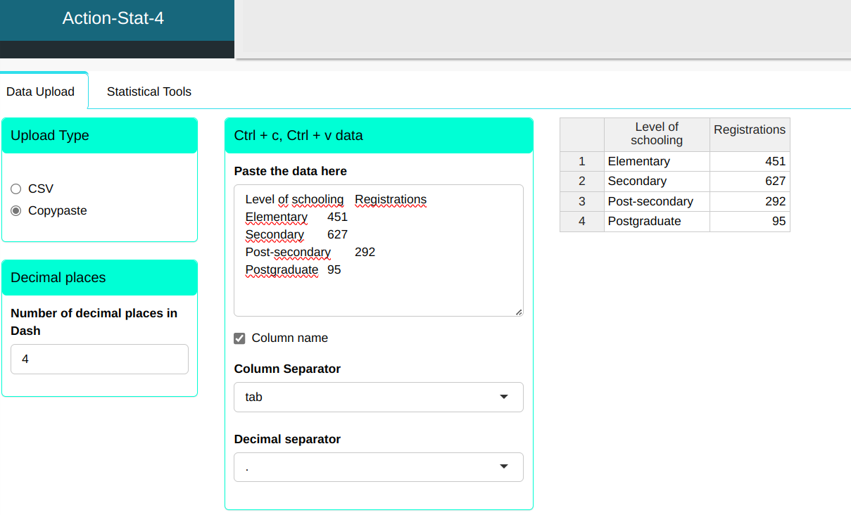
In a public competition, the number of people enrolled according to education levels: complete primary, secondary complete, complete higher education and complete postgraduate studies. We will upload of data in the system.
| Level of schooling | Registrations |
|---|---|
| Elementary | 451 |
| Secondary | 627 |
| Post-secondary | 292 |
| Postgraduate | 95 |
Configuring according to the figure below and we will make the bar graph.
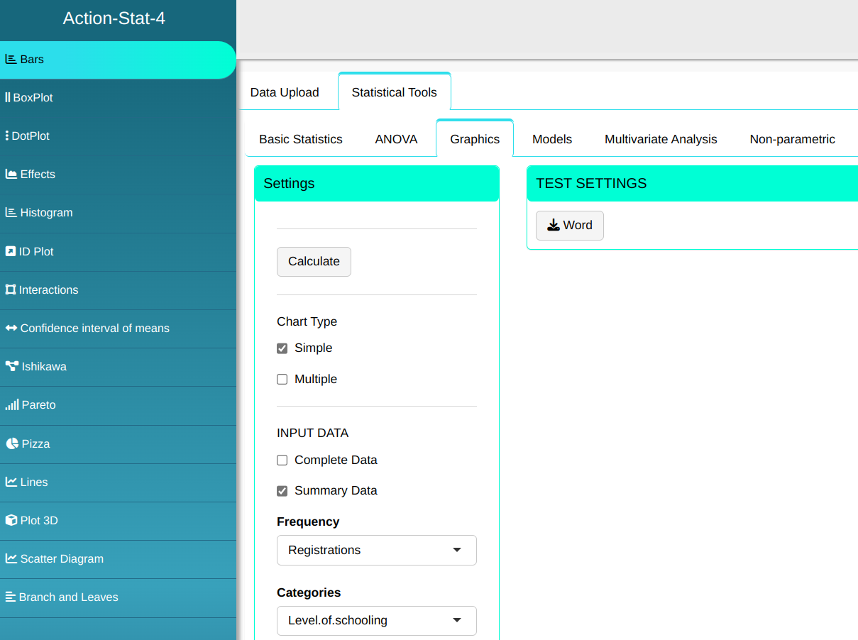
Then click Calculate to get the results. You can also generate the analyses and download them in Word format.

The results are:
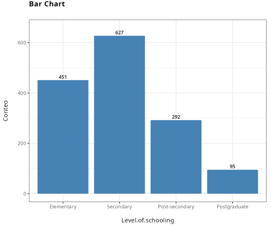
In the graph, it is clear that the number of candidates for the competition who have the postgraduate level is much lower than the others.