14. Scatter Diagram
The scatter diagram is a graph that allows you to visualize a possible association between quantitative variables.
Example 1:
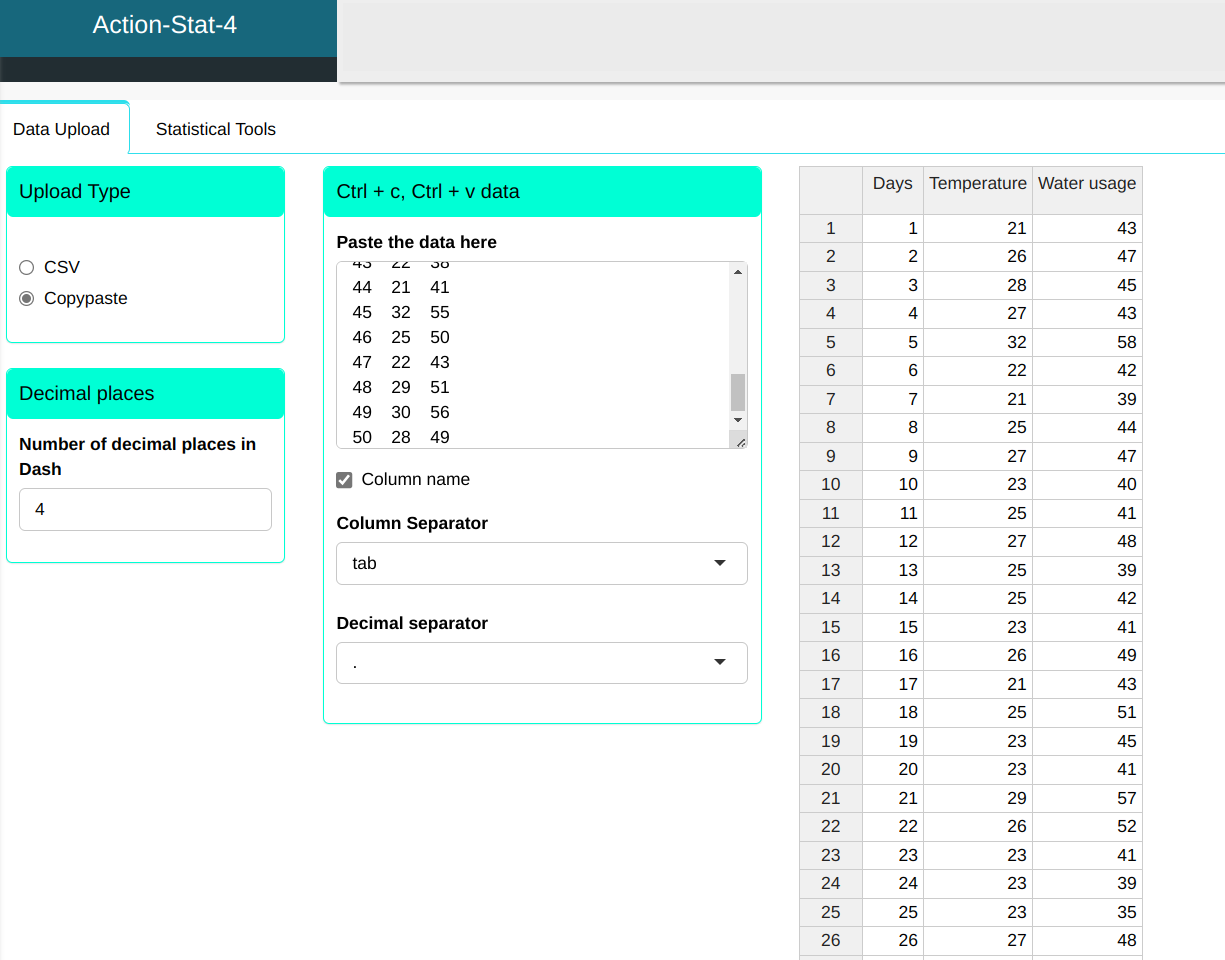
Over a period of 50 days, the ambient temperature and water consumption of a residence in the city of São Paulo were recorded. The data are shown in the table below
| Days | Temperature | Water usage |
|---|---|---|
| 1 | 21 | 43 |
| 2 | 26 | 47 |
| 3 | 28 | 45 |
| 4 | 27 | 43 |
| 5 | 32 | 58 |
| 6 | 22 | 42 |
| 7 | 21 | 39 |
| 8 | 25 | 44 |
| 9 | 27 | 47 |
| 10 | 23 | 40 |
| 11 | 25 | 41 |
| 12 | 27 | 48 |
| 13 | 25 | 39 |
| 14 | 25 | 42 |
| 15 | 23 | 41 |
| 16 | 26 | 49 |
| 17 | 21 | 43 |
| 18 | 25 | 51 |
| 19 | 23 | 45 |
| 20 | 23 | 41 |
| 21 | 29 | 57 |
| 22 | 26 | 52 |
| 23 | 23 | 41 |
| 24 | 23 | 39 |
| 25 | 23 | 35 |
| 26 | 27 | 48 |
| 27 | 26 | 45 |
| 28 | 30 | 54 |
| 29 | 28 | 53 |
| 30 | 20 | 36 |
| 31 | 24 | 46 |
| 32 | 21 | 42 |
| 33 | 20 | 40 |
| 34 | 25 | 39 |
| 35 | 30 | 57 |
| 36 | 23 | 46 |
| 37 | 26 | 49 |
| 38 | 21 | 40 |
| 39 | 31 | 60 |
| 40 | 25 | 52 |
| 41 | 23 | 53 |
| 42 | 18 | 35 |
| 43 | 22 | 38 |
| 44 | 21 | 41 |
| 45 | 32 | 55 |
| 46 | 25 | 50 |
| 47 | 22 | 43 |
| 48 | 29 | 51 |
| 49 | 30 | 56 |
| 50 | 28 | 49 |
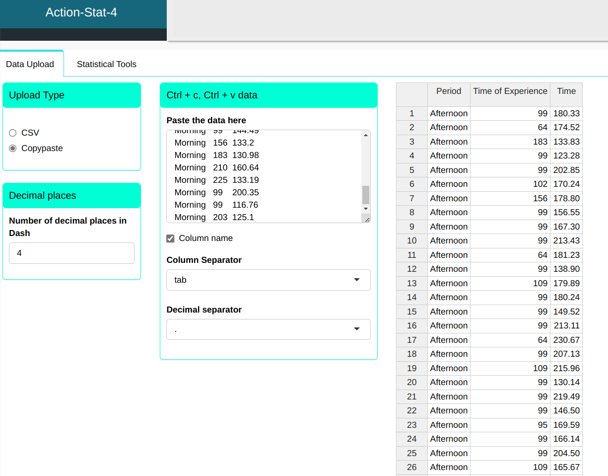
We will upload the data to the system.
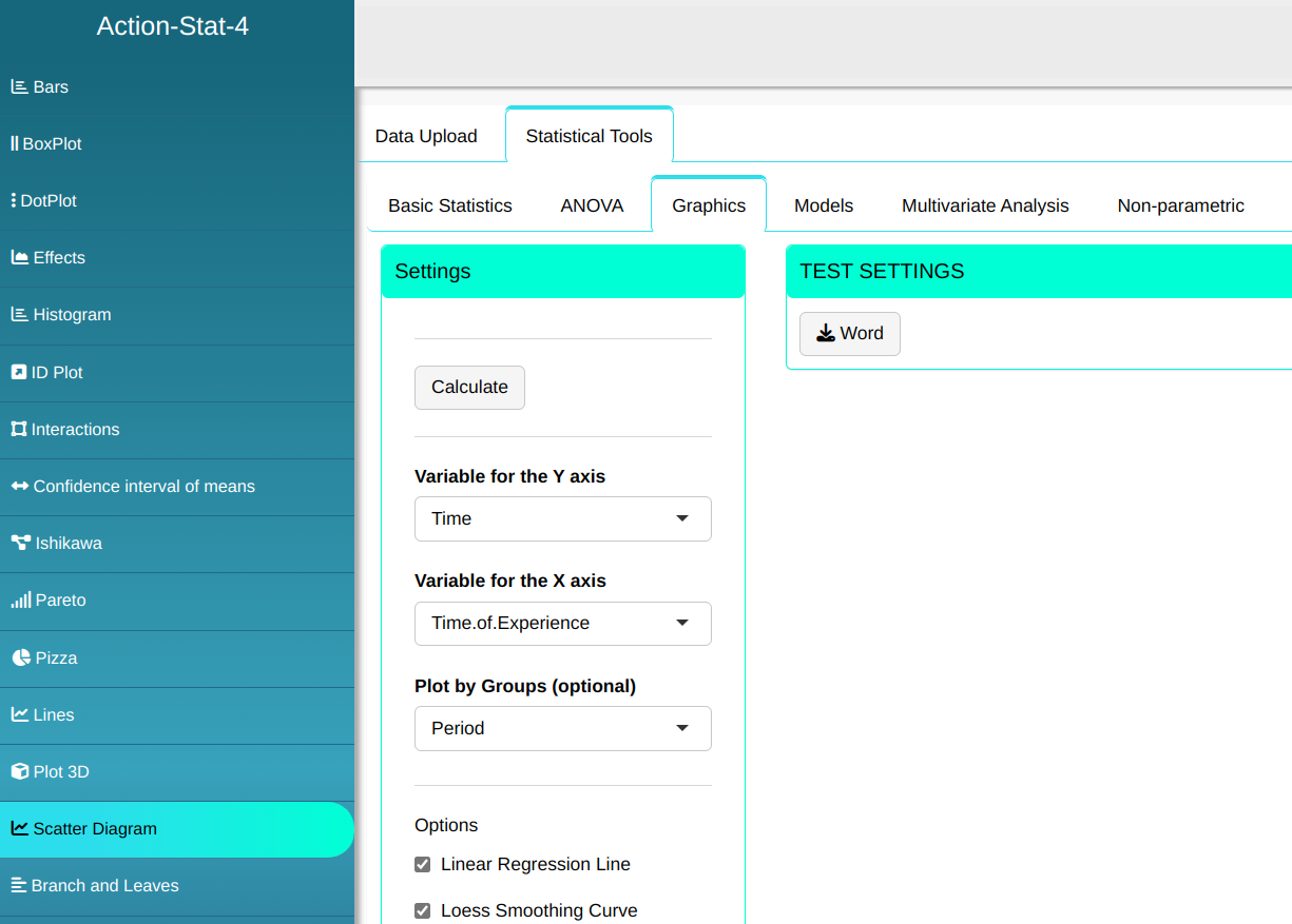
We will do o the scatter plot..
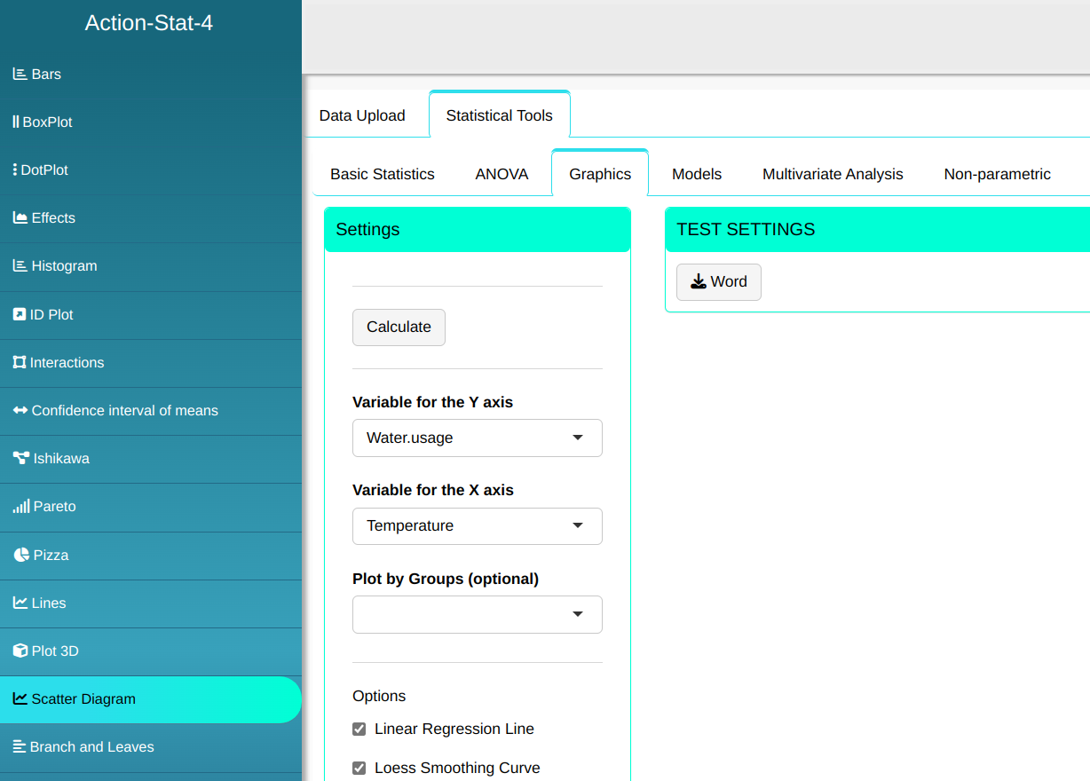

Then click Calculate to get the results. You can also generate the analyses and download them in Word format.
The results are:
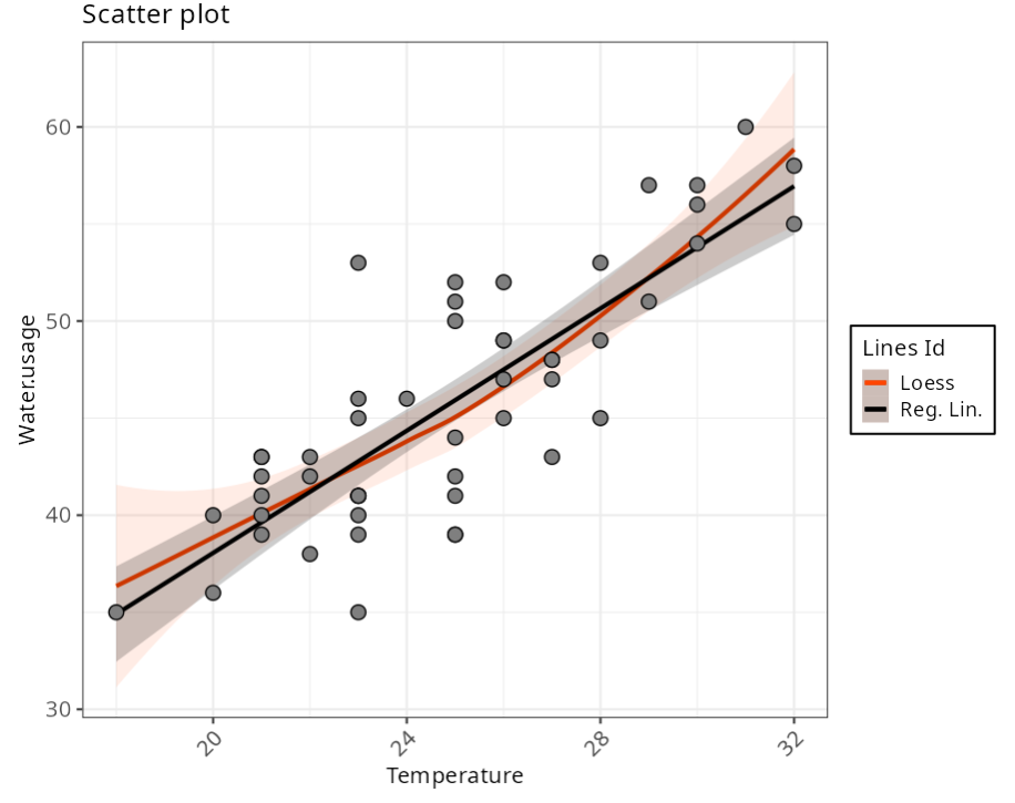
The graph above shows that there is a linear relationship between temperature and water consumption. As the temperature rises, so does consumption also increases.
Exemplo 2:
A call center company aims to measure the performance of its agents by their length of experience in the company. Average call times (seconds) were measured times (seconds) were measured over the course of a month in the morning and afternoon. the attendant’s length of experience in days was reported.
| Period | Time of Experience | Time |
|---|---|---|
| Afternoon | 99 | 180.33 |
| Afternoon | 64 | 174.52 |
| Afternoon | 183 | 133.83 |
| Afternoon | 99 | 123.28 |
| Afternoon | 99 | 202.85 |
| Afternoon | 102 | 170.24 |
| Afternoon | 156 | 178.8 |
| Afternoon | 99 | 156.55 |
| Afternoon | 99 | 167.3 |
| Afternoon | 99 | 213.43 |
| Afternoon | 64 | 181.23 |
| Afternoon | 99 | 138.9 |
| Afternoon | 109 | 179.89 |
| Afternoon | 99 | 180.24 |
| Afternoon | 99 | 149.52 |
| Afternoon | 99 | 213.11 |
| Afternoon | 64 | 230.67 |
| Afternoon | 99 | 207.13 |
| Afternoon | 109 | 215.96 |
| Afternoon | 99 | 130.14 |
| Afternoon | 99 | 219.49 |
| Afternoon | 99 | 146.5 |
| Afternoon | 95 | 169.59 |
| Afternoon | 99 | 166.14 |
| Afternoon | 99 | 204.5 |
| Afternoon | 109 | 165.67 |
| Afternoon | 102 | 206.31 |
| Afternoon | 99 | 147.16 |
| Afternoon | 156 | 193.19 |
| Morning | 99 | 143.63 |
| Morning | 99 | 164.09 |
| Morning | 298 | 137.1 |
| Morning | 64 | 174.98 |
| Morning | 99 | 174.92 |
| Morning | 183 | 150.91 |
| Morning | 225 | 136.63 |
| Morning | 129 | 144.59 |
| Morning | 225 | 147.87 |
| Morning | 193 | 161.81 |
| Morning | 99 | 165.23 |
| Morning | 283 | 176.1 |
| Morning | 99 | 142.56 |
| Morning | 99 | 110.72 |
| Morning | 210 | 153.64 |
| Morning | 234 | 155.14 |
| Morning | 283 | 158.07 |
| Morning | 225 | 161.76 |
| Morning | 193 | 168.88 |
| Morning | 193 | 158.78 |
| Morning | 99 | 158.14 |
| Morning | 99 | 195.69 |
| Morning | 99 | 144.49 |
| Morning | 156 | 133.2 |
| Morning | 183 | 130.98 |
| Morning | 210 | 160.64 |
| Morning | 225 | 133.19 |
| Morning | 99 | 200.35 |
| Morning | 99 | 116.76 |
| Morning | 203 | 125.1 |
We will upload the data to the system.
We will do o the scatter plot..
Then click Calculate to get the results. You can also generate the analyses and download them in Word format.
The results are:
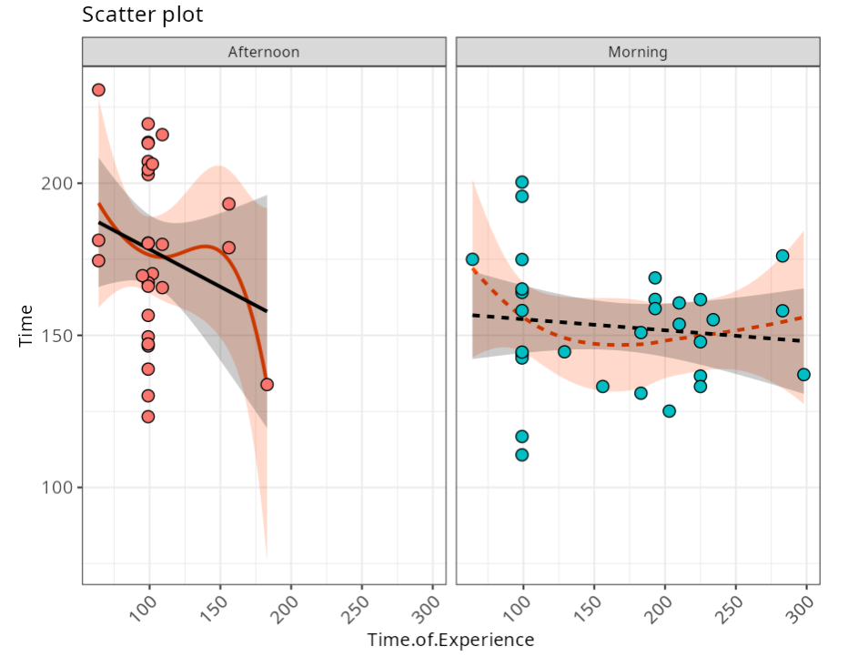
The graph above shows a steeper learning curve for in the afternoon, i.e. for the afternoon, the more time the attendants have of experience, the shorter the average service time.