10. Pareto Diagram
The Pareto diagram is a bar graph that orders the frequencies of occurrences, from largest to smallest, allowing prioritization of problems. It also shows the curve of accumulated percentages. Your biggest usefulness is to allow easy visualization and identification of most important causes or problems, enabling the concentration of efforts on them.
Example:
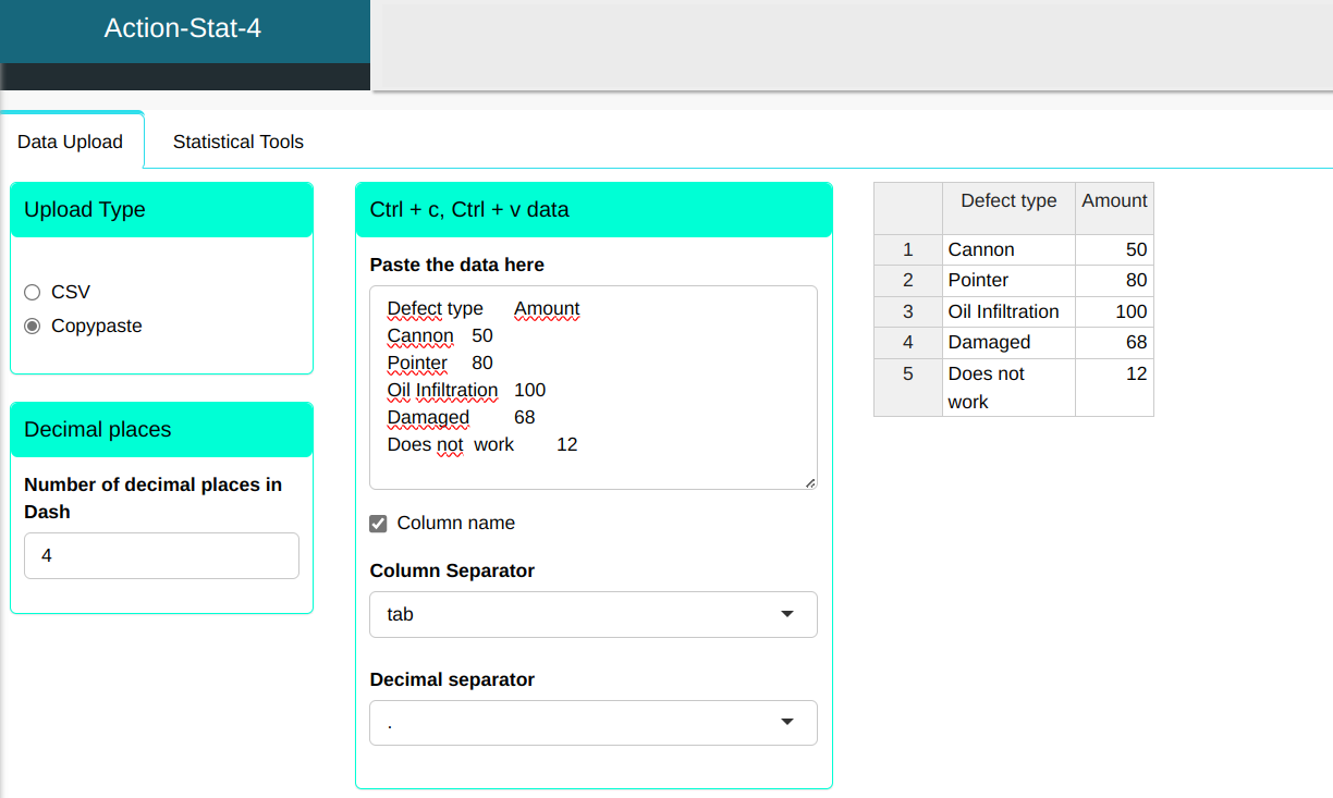
An automotive company monitors the defects found in dial indicators used in the machining area. In the table that we will upload it to the system, present the data for one month monitoring defects detected by the maintenance area equipment.
| Defect type | Amount |
|---|---|
| Cannon | 50 |
| Pointer | 80 |
| Oil Infiltration | 100 |
| Damaged | 68 |
| Does not work | 12 |
To perform the Pareto diagram, the following configuration is designed, as shown in the figure below.
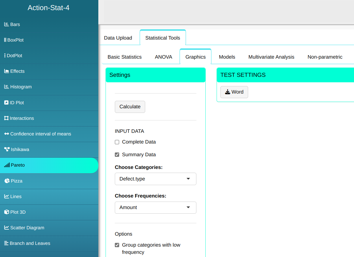

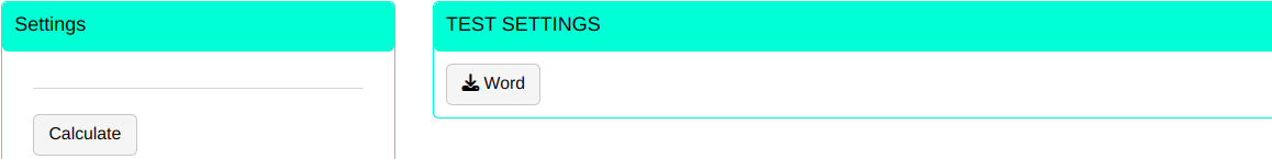
Then click Calculate to get the results. You can also generate the analyses and download them in Word format.
The results are:
Relative Frequencies
| Category | Frequency | Accumulative Freq. | Percentage | Accumulated Perc. |
|---|---|---|---|---|
| Oil infiltration | 100 | 100 | 32,258 | 32,258 |
| Pointer | 80 | 180 | 25.806 | 58.065 |
| Damaged | 68 | 248 | 21.935 | 80.000 |
| Cannon | 50 | 298 | 16.129 | 96.129 |
| Doesn’t work | 12 | 310 | 3.871 | 100.000 |
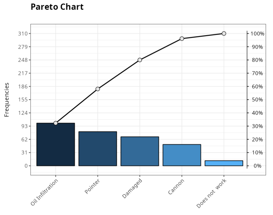
The table above shows the frequency, accumulated frequency, percentage and accumulated percentage. Through these values, we arrive at conclusion that Oil seepage, Pointer and Damaged correspond to 80% of defects.