11. Pizza Chart
It is a circular diagram where the areas of each sector are proportional to the respective frequencies. This graph may be accompanied by your respective percentages.
Example:
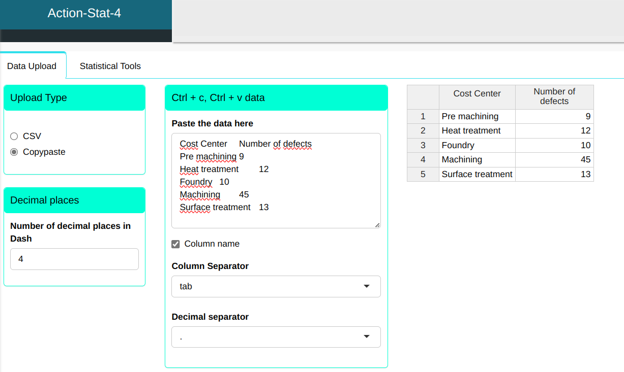
An automotive company monitors the number of defects found in the equipment sent for calibration. In the table that we will upload it to the system, present the data for one month monitoring defects found in the equipment of the various areas.
| Cost Center | Number of defects |
|---|---|
| Pre machining | 9 |
| Heat treatment | 12 |
| Foundry | 10 |
| Machining | 45 |
| Surface treatment | 13 |
Configuring according to the figure below, we will make the pie chart.
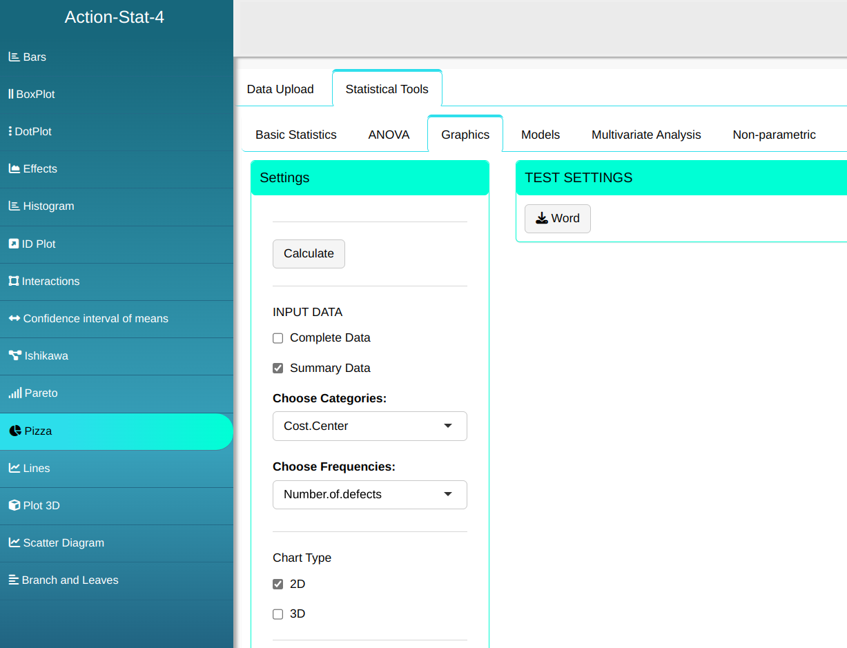

Then click Calculate to get the results. You can also generate the analyses and download them in Word format.

The results are:
| Category | Frequencies | Perc. Freq. | Cum. Freq. |
|---|---|---|---|
| Pre-machining | 9 | 10.11 | 10.11 |
| Heat treatment | 12 | 13.48 | 23.59 |
| Foundry | 10 | 11.24 | 34.83 |
| Machining | 45 | 50.56 | 85.39 |
| Surface treatment | 13 | 14.61 | 100.00 |
| Total | 89 | 100 | 100.00 |
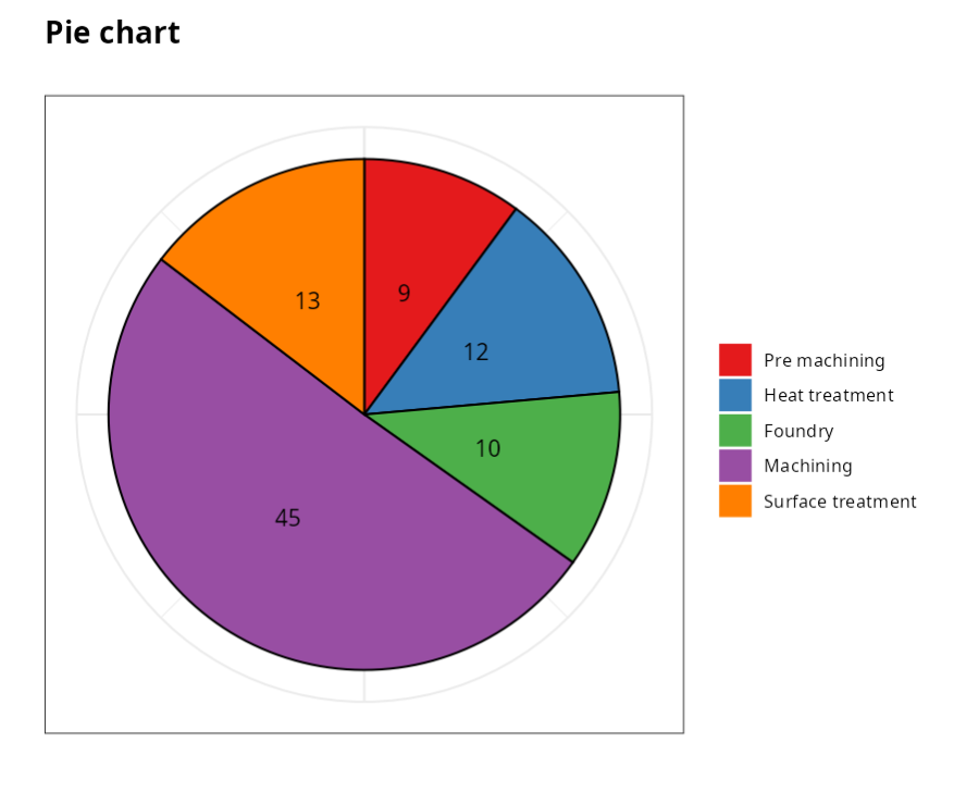
The graph above allows us to see that the machining area is responsible due to the greater occurrence of defects, representing around half of this total.