1. Graphic Analysis
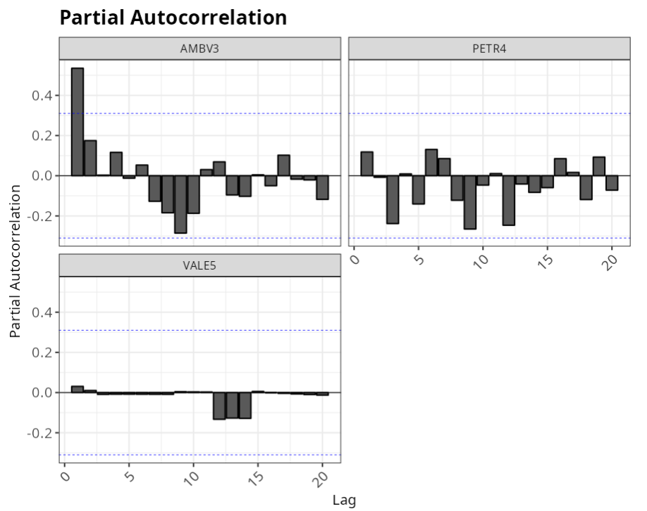
We are often confronted with experiments that evolve over time. To better understand this type of experiments, graphical analysis is an essential tool. Graphical analysis allows us to visualize the time series plots, the autocorrelation function, the partial autocorrelation function and the covariance. With the time series plot, it is possible to subjectively identify whether the data show any particular behavior, such as a trend or seasonality. The FAC and FACP plots help to identify possible models for fitting the data
Example:
Graphical analysis of financial assets AMBV3, PETR4 and VALE5.
| AMBV3 | PETR4 | VALE5 |
|---|---|---|
| 83 | 99 | 16 |
| 84 | 14 | 16 |
| 83 | 7 | 16 |
| 83 | 5 | 16 |
| 83 | 22 | 16 |
| 83 | 37 | 16 |
| 83 | 54 | 16 |
| 83 | 18 | 16 |
| 82 | 41 | 16 |
| 82 | 5 | 16 |
| 82 | 97 | 16 |
| 83 | 26 | 16 |
| 82 | 67 | 16 |
| 83 | 64 | 16 |
| 83 | 64 | 16 |
| 83 | 53 | 16 |
| 83 | 77 | 16 |
| 83 | 78 | 17 |
| 84 | 12 | 17 |
| 84 | 8 | 17 |
| 84 | 2 | 16 |
| 83 | 88 | 16 |
| 84 | 1 | 16 |
| 84 | 4 | 16 |
| 84 | 25 | 16 |
| 84 | 23 | 16 |
| 84 | 1 | 16 |
| 83 | 69 | 16 |
| 83 | 69 | 16 |
| 83 | 53 | 16 |
| 84 | 5 | 16 |
| 84 | 16 | 9 |
| 83 | 5 | 16 |
| 83 | 27 | 16 |
| 83 | 68 | 16 |
| 82 | 97 | 16 |
| 83 | 31 | 16 |
| 83 | 41 | 16 |
| 83 | 2 | 16 |
| 83 | 3 | 16 |
We will upload the data to the system.
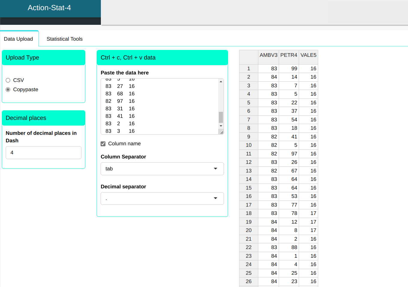
The graphical analysis will be performed according to the configuration shown in the figure below.


Then click Calculate to get the results. You can also generate the analyses and download them in Word format.
The results are: